
01Packaging Decision Center

Kraft vs White Packaging Board

Compare kraft and white packaging surfaces for artwork, color appearance, visible edges and custom box presentation.

Buyer decision supportFoshan, Guangdong, China

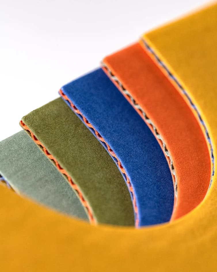
Kraft and white corrugated packaging board color options

Direct answer

What should a buyer know first?

Kraft surfaces retain a natural brown base that becomes part of the artwork, while white board gives colors a lighter, more neutral starting surface. Neither is automatically more suitable: the choice depends on brand direction, print coverage, visible edges and the actual board construction.

Comparison

Compare the decision factors

Compare the visible surface before deciding artwork treatment.

DecisionKraft surfaceWhite surface
Base colorWarm brown tone remains visibleLight neutral starting point
Artwork planningAllow for base color interactionCloser to conventional white-paper artwork expectations
Visual directionNatural, material-forward appearanceClean, bright presentation
Approval focusContrast and unprinted areasColor consistency and surface finish

02

The substrate is part of the color

Ink does not appear independently of the paper beneath it. On kraft, unprinted areas and lighter colors interact with the brown base. On white board, colors begin from a lighter surface, though coating and gloss can still change the result.

Prepare artwork for the chosen substrate. A mockup that hides the board color can create a false expectation, especially around pale colors, fine type and large unprinted areas.

03

Choose the whole board, not a color label

Kraft and white are surface descriptions, not complete performance specifications. Paper grade, corrugated construction, thickness, direction and finish must still be selected for the package.

Ask whether inside surfaces, cut edges or flute edges will be visible. Those details can influence whether the material appearance supports the intended presentation.

04

Print review should use the intended surface

For simple dark artwork, kraft can provide clear contrast when the design is prepared accordingly. For light photographic or color-critical artwork, a white surface may be a more direct starting point, but a press proof or printed sample remains important.

Specify CMYK or Pantone references where relevant and clarify whether the target is a close visual direction or a color-critical requirement.

05

Turn the preference into an RFQ

Send the packaging structure, visible surfaces, artwork coverage and desired board color. If you are undecided, provide both the brand artwork and a reference showing the desired material character.

The final board identity and print treatment remain open until they are confirmed in the project review.

Buyer checklist

Put these details in the brief

  • Preferred outer and inner surface color
  • Artwork coverage and light-color areas
  • Visible cut or flute edges
  • Print color specification
  • Finish or lamination requirement
  • Physical sample requirement

Buyer questions

Frequently asked questions

Will CMYK look the same on kraft and white board?
No. The base surface affects perceived color and contrast. Evaluate artwork on the proposed material.
Does white board mean a coated surface?
Not necessarily. White describes the visible color; the exact paper and surface treatment must be specified separately.
Can kraft and white board use the same dieline?
Only after confirming the constructions are equivalent for the structure. Board build and thickness can require dieline adjustments.

Project-specific confirmation

Turn this decision into a packaging specification.

Send the product, dimensions, quantity, artwork status and destination. Unknown details can remain “to be confirmed.”

Request a Custom Packaging Quote